8.7 EMP_heatmap_plot
Heatmaps are used to visualize data matrices by representing values through color gradients, providing a clear view of patterns and relationships within datasets, which is widely applied in fields like bioinformatics, data analysis, and statistics.
8.3.1 Heatmap for assay
Note:
①Before plotting the heatmap, the user can use the module
②Pamameter
①Before plotting the heatmap, the user can use the module
EMP_decostand for normalization to achieve the best visual enhancement.②Pamameter
palette can specify the color.
🏷️Example:
MAE |>
  EMP_assay_extract('geno_ec') |>
  EMP_diff_analysis(method='DESeq2',.formula = ~Group) |>
  EMP_filter(feature_condition = pvalue<0.05 & abs(fold_change) >3.5) |>
  EMP_decostand(method = 'clr') |>
  EMP_heatmap_plot(clust_row=TRUE,clust_col=TRUE,rotate=TRUE)
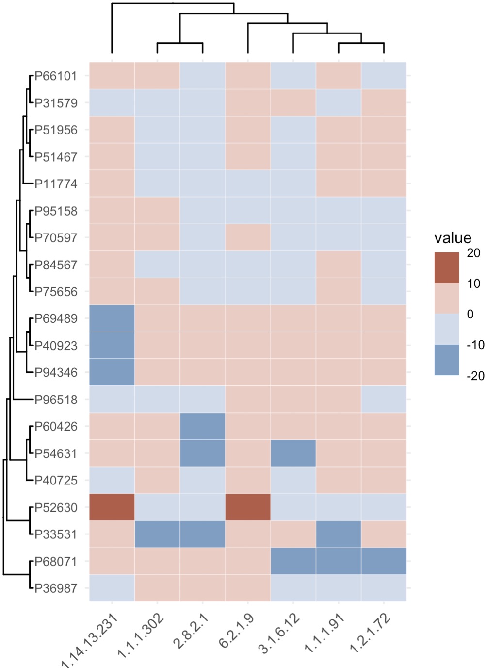
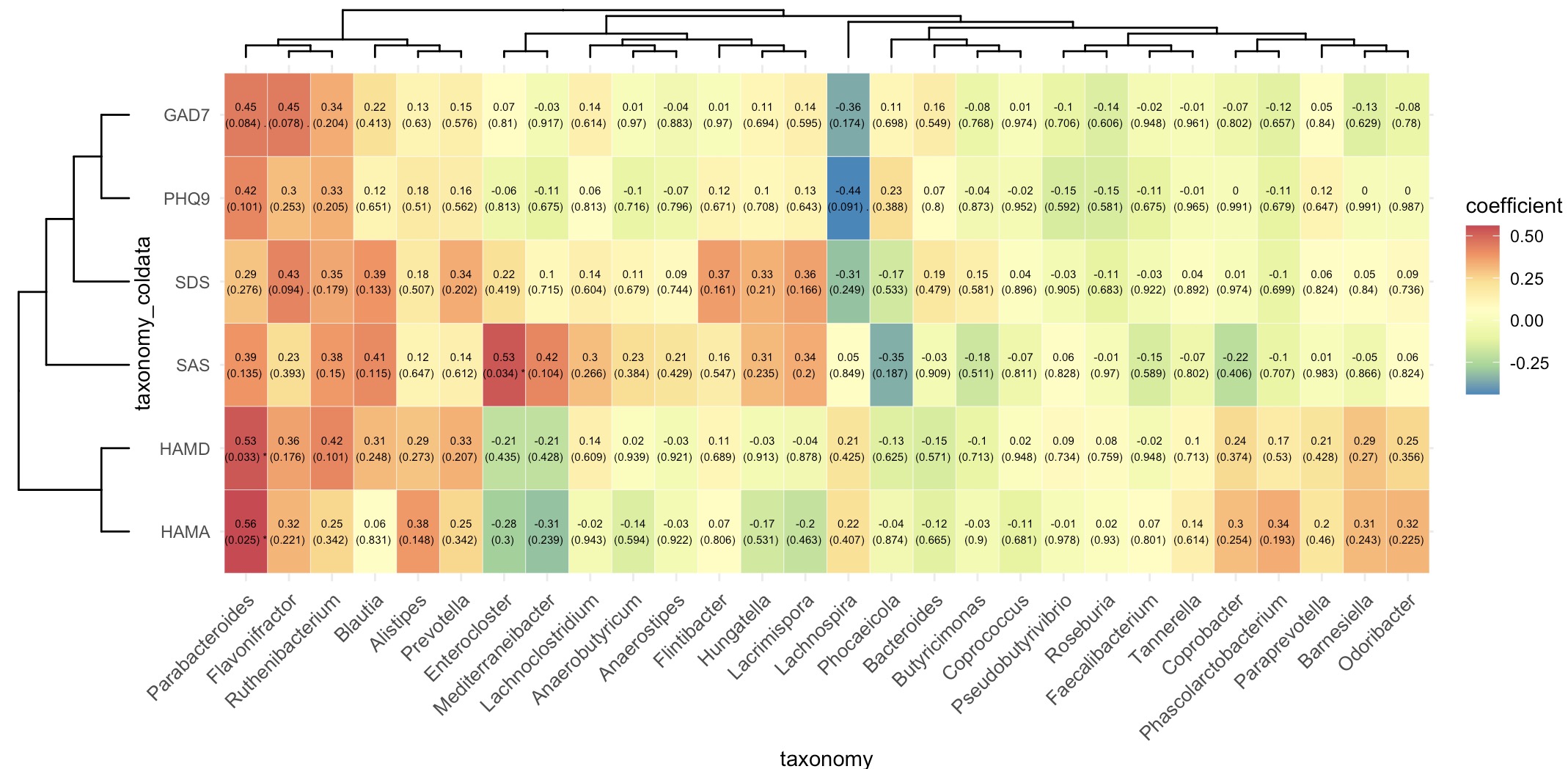
8.3.2 Heatmap for correlation analysis
🏷️Example:
micro_data <- MAE |>
  EMP_assay_extract('taxonomy') |>
  EMP_identify_assay(method='default') |>
  EMP_collapse(estimate_group = 'Genus',collapse_by = 'row') |>
  EMP_decostand(method='relative')

meta_data <- MAE |>
  EMP_assay_extract('taxonomy') |>
  EMP_coldata_extract(action = 'add',
                      coldata_to_assay = c('SAS','SDS','HAMA','HAMD','PHQ9','GAD7'))
(micro_data + meta_data) |>
  EMP_cor_analysis() |>
  EMP_heatmap_plot(label_size=2,palette='Spectral',
                   clust_row=TRUE,clust_col=TRUE)
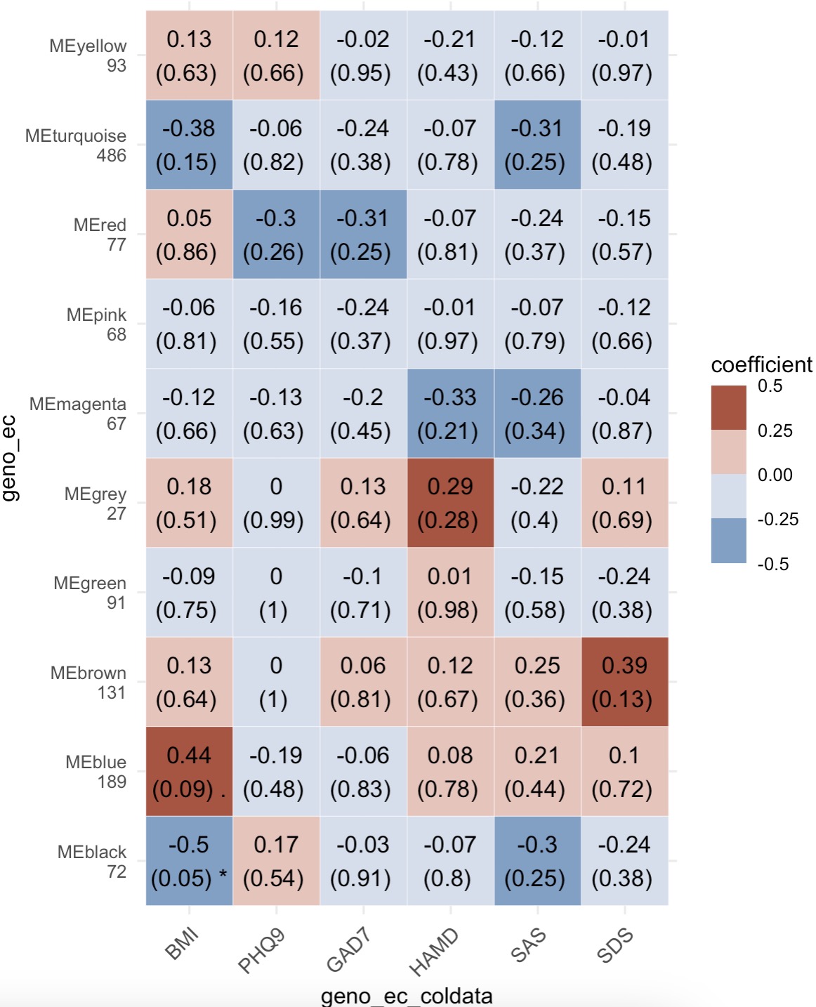
8.3.3 Heatmap for WGCNA
🏷️Example:
MAE |>
  EMP_assay_extract('geno_ec')  |>
  EMP_identify_assay(method = 'edgeR',estimate_group = 'Group') |>
  EMP_WGCNA_cluster_analysis(RsquaredCut = 0.85,mergeCutHeight=0.4)  |>
  EMP_WGCNA_cor_analysis(coldata_to_assay = c('BMI','PHQ9','GAD7','HAMD','SAS','SDS')) |>
  EMP_heatmap_plot()